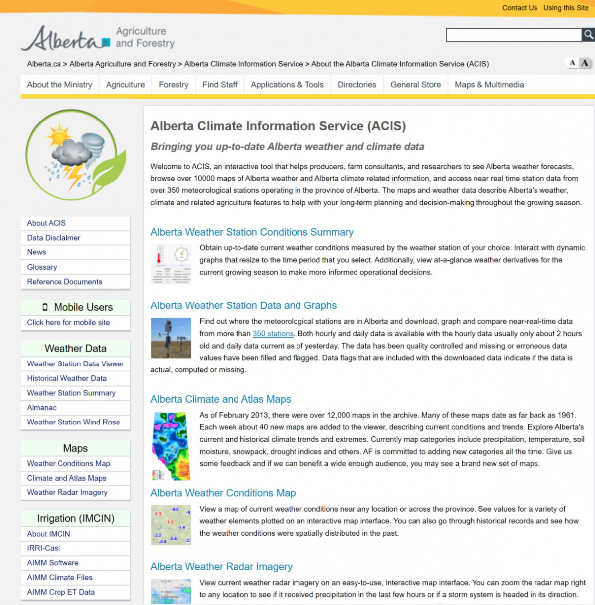
The Alberta Climate Information Service
Posted by Jeremy Boychyn | Agronomy Research Extension Specialist | Alberta Wheat and Barley Commissions|February 13, 2020
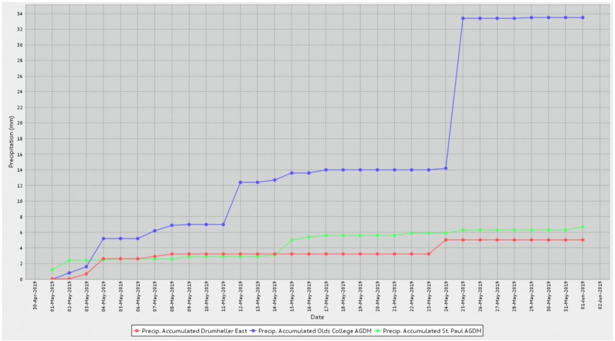
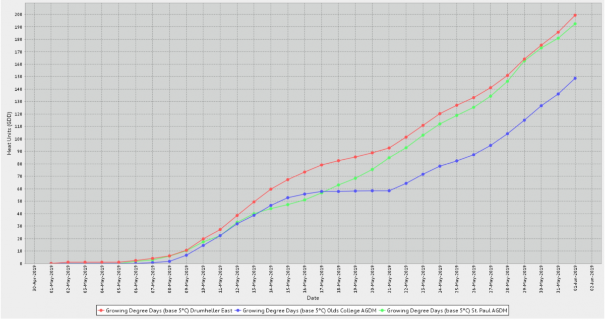
A very useful tool for producers and agronomists is the Alberta Climate Information Service (ACIS). This resource is a wealth of information that is collected from the over 350 weather stations scattered across Alberta. I personally utilize this tool at least weekly in-season to collect weather data including accumulated precipitation (Figure 1), growing degree day accumulation (Figure 2), temperature ranges and wind speeds, to name a few. It also can provide frost probabilities at different temperatures for different regions based on historical data. Figure 3 shows the potential frost probability at 0°C for Craigmyle, Vegreville, and Wetaskiwin.
Figure 1: Accumulated precipitation for Drumheller East, Olds College AGDM, and St. Paul AGDM between May 1 2019 and June 1 2019

Figure 2: Growing Degree Day accumulation for Drumheller East, Olds College AGDM, and St. Paul AGDM between May 1 2019 and June 1 2019
These tools have proven to be very useful when trying to understand agronomic challenges. If you don’t have weather stations on your farm, they can provide information on rainfall in your area or tell you if frost did actually occur in your region on a certain date. I personally used this website to determine heat unit accumulation differences between years in different regions (Table 1).
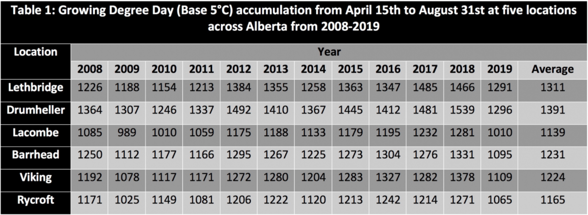
Figure 4: Opening summary of Strathmore AB weather station taken February 10, 2020
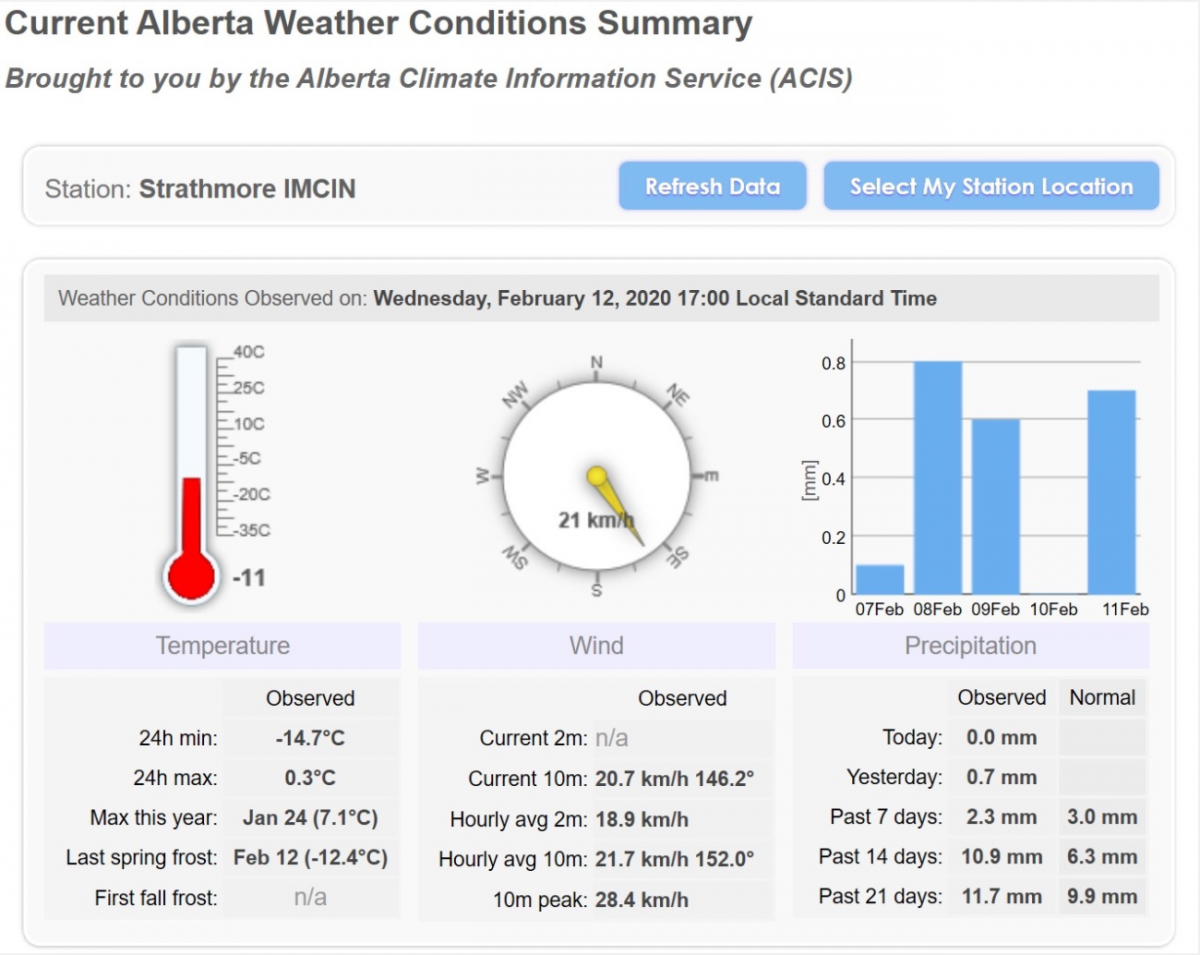
Figure 6: Location of ‘Weather Station Data Viewer’, ‘Climate and Atlas Maps’, ‘Weather Station Summary’ page on main page of Alberta Climate Information Service
WSDV
Once you open the WSDV (visual of page in Figure 7), select a weather station denoted as a yellow dot on the map. You can select up to five. Once you’ve selected the station(s), you can select the data you want to view. The tabs in the center of the page listed; ‘Popular’, ‘Elements’, ‘Derivatives’, ‘Normals’, and ‘Almanac’ hold all of the data options. Most of the basic selections can be found in the ‘Popular’ tab. Let’s say you wanted to find the observed temperature for the weather stations you’ve already selected. First, click the box beside ‘Temperature’. You’ll notice there are two boxes you can potentially click. ‘Observed’ and ‘Normal’. ‘Observed’ is what data was actually collected and ‘Normal’ is the average based on cumulative years. Click both if you want to see a comparison between actual observed and normal. Next, select the time range. ‘Starting date’ and ‘end date’ and end date for the data you are looking to collect. Then click ‘Graph’. A graph displaying the data in question will display. Below is an example of actual temperature compared to normal temperatures in Strathmore AB between June 1, 2019 and June 30, 2019 can be seen in Figure 8.
Figure 7: First page of WSDV

Figure 8: Actual temperature compared to normal temperatures in Strathmore AB between June 1, 2019 and June 30, 2019

This process is the same for any of the other data options within those five tabs of ‘Popular’, ‘Elements’, ‘Derivatives’, ‘Normals’, and ‘Almanac’.
CAM
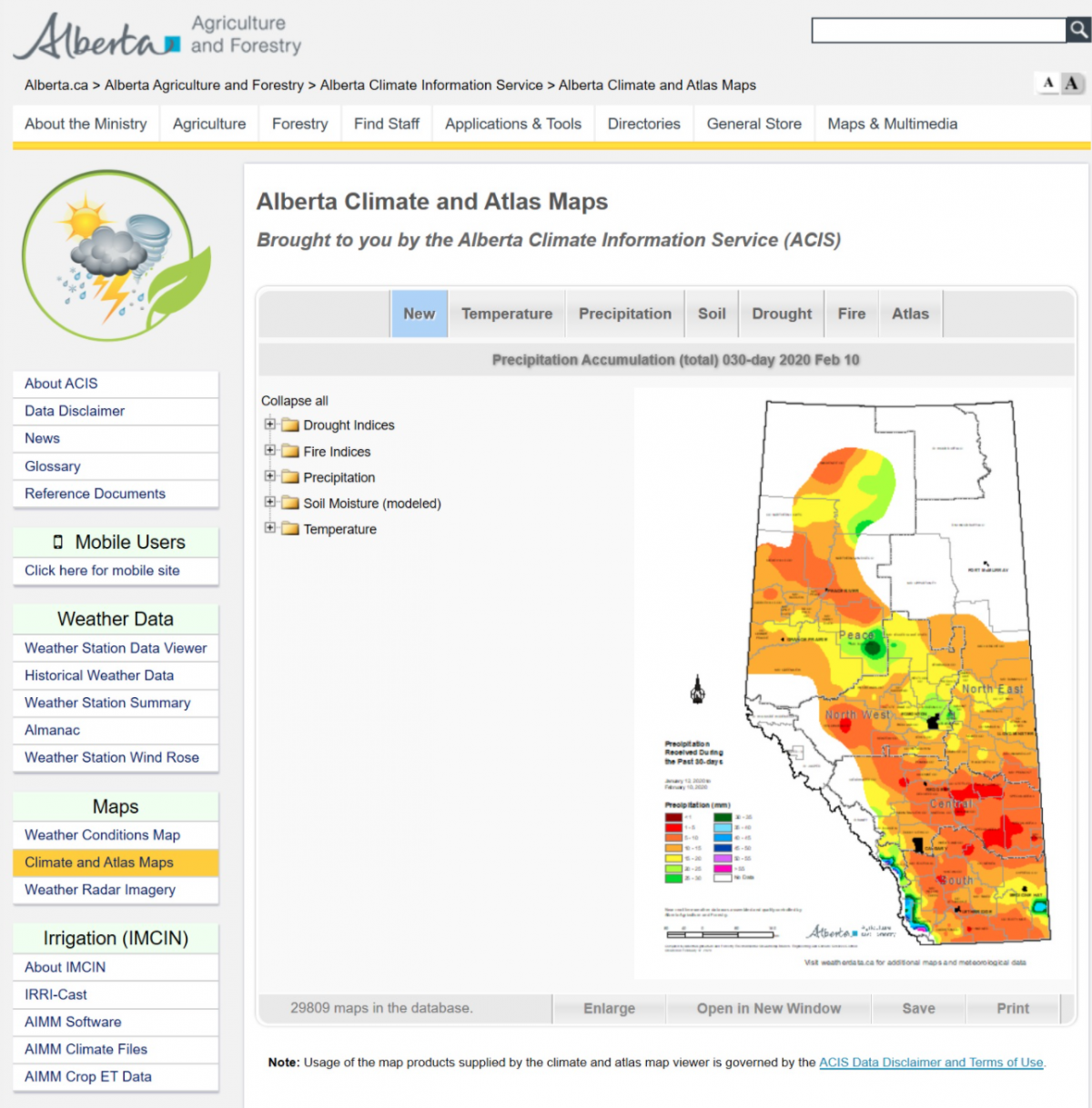
The CAM section of the ACIS website is much simpler as it is mainly a collection of maps with data that has been visualized and overlaid on the province map. The CAM section can be found on the same left column as the WSDV except lower down in the ‘Maps” section. Click ‘Climate and Atlas Maps’. The page will open and seven tabs will be available on the top: ‘New’, ‘Temperature’, ‘Precipitation’, ‘Soil’, ‘Drought, ‘Fire’, and ‘Atlas’ (Figure 9). Once you click into one of those tabs, folder options will appear in the column beside the map. The majority of the folders are labelled rather intuitively with the exception of ‘Atlas’. Within this tab and in the folder ‘Agroclimatic Atlas’, you can find numerous maps containing averages for precipitation, temperatures, heat units, and more from various time periods. Figure 7 is a map pulled from CAM that shows average heat units across Alberta from May 1st to September 15 between the years 1951 and 2010.
Fusarium Disease Severity
In addition to the two major features of ACIS, it is also home to the Fusarium Disease Severity Map. Supported by the Alberta Wheat Commission, the Fusarium Disease Severity Map, or the Fusarium Risk Map, identifies the risk of Fusarium Head Blight (FHB) for regions based on weather data collected from the over 350 weather stations. More on this great tool can be found here.
The website is a great tool to add context and gain understanding of climactic trends in Alberta. The areas of the website that have been outlined above are only a few of the tools that are available. Take the time to explore it and see how it may provide value for you.
Figure 9: Opening page of CAM